Posted in Book covers

The book cover debate: Here we go again

?????????????Almost two years ago to the day, I wrote a backstory about my book cover adventures. Then back in May of this, I wrote about the beginning of my newest book cover adventure starting with the news from my editor at that, as he said in an email, “Time and budgetary restraints being what they are, we’re unable to ask our designers to come up with a cover completely from scratch. Rather, it falls to you (and to me)…”  And that’s what got me thinking about the differences (or lack thereof) between traditional and independent publishing.  At that time I lamented that if I have to design my own cover, what in the world are publishers paying those designers to do exactly?

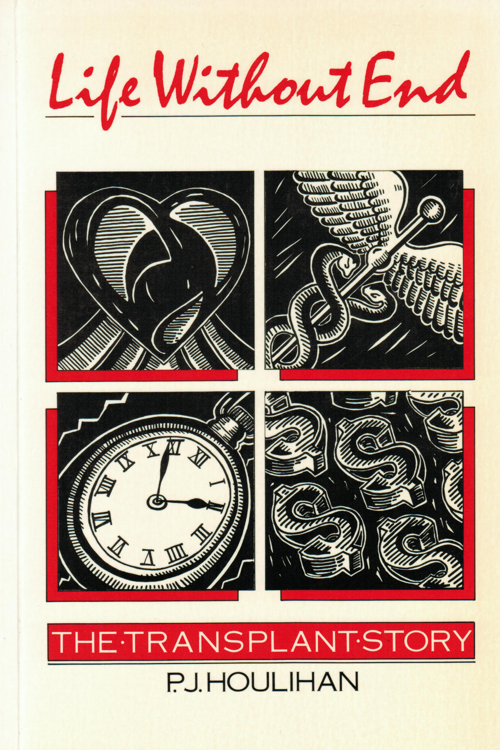
So, I went on to the web site where this publisher buys stock photos and drawings to search through thousands of images using a variety of relevant search terms.  I narrowed it down to a few, modified them in Photoshop, added the appropriate cover text, ran the design by my in-house consultant (my husband) and sent the mock-up along to my editor.  A month or so later (he apologized for taking so long to get back to me – evidently during conference season it’s hard to find their marketers.  It occurs to me that if you’re at conferences selling books, then you are a sales person.  If you are a marketer, I thought that you worked on marketing strategy including cover design – but I digress), he emailed me telling me that my cover mock-up was clever, but they didn’t think it really represented the book very well.  Never mind that I don’t think a single member of the ‘marketing team’ has actually read the book.

Then he sent me a stock photo that they thought was appropriate.  It. Was. Not.  And it wasn’t clever.  And it wasn’t interesting.  And it wasn’t an image that a single one of my intended readers (this is targeted non-fiction this time) could identify with or would even click on to get further information – and make no mistake, that’s how books are bought these days, particular this kind since they are not designed to go to book stores.

life without end
My first-ever book published by a now-defunct Toronto publisher. Twenty-four years ago, designers actually designed clever covers. It’s time for them to start again.

As any writer of book-length work realizes, the old maxim “You can’t tell a book by its cover” is becoming more and more irrelevant.  You might not be able to tell a lot about what’s behind that cover just by seeing the image and text, but in my view (a) you ought to be able to, and (b) that cover really does need to be dynamite these days.

I recently read a marketing study where eBook covers had been changed and sales tracked before and after the change.  Just as you might expect, improving the cover increased sales.  Although this is not an eBook (but there will be an electronic version naturally), sales will accrue through online channels.  This means that the potential buyers will be moved to either explore further or not by what they see on that cover.  The truth is, though, that no one has the definitive answer to the question of what makes a truly good book cover design.  That’s because each book is unique.  So where does that leave us?

Just by coincidence, or perhaps serendipity, The New Yorker online published a piece today titled The Decline and Fall of the Book Cover.  The writer Tim Kreider says,”… publishing houses hire professional designers for books’ covers and allow their authors very little say over them…”  Clearly he doesn’t know about smaller publishers who seem to have less than no money these days for design.  He did however describe his own recent experience in which he seemed to have embarked on a similar back and forth between him and his publisher on the design of his book cover.  When he suggested that the cover he liked the least was always the one they seem to like the best, I was on his side again.  However, he seems to think that well-designed book covers are on their way out, blaming the electronic book trend for this phenomenon.  Book covers, he believes, are dull and getting duller.  I happen to think that book cover design is going to be even more important as we move ever deeper into electronic purchasing and electronic reading.

I will say that I was completely in agreement with him at the end of the piece when he and his publisher finally agreed on the cover design for the new book.  He describes it this way:  “…a result nobody would voluntarily have chosen but which everyone could acquiesce to, if only out of exhaustion.”

I am sorely afraid that this is what will eventually become the cover my new book.  And it had better happen fast because it’s on the publisher’s fall list.

Again the question: What makes a good cover design?  No one really knows these days.  While I await my editor’s next move (back to the drawing board he said yesterday after he finally, a month later, responded to my email detailing why I thought his suggestion was lame) I’d be interested to know what draws you into a book that no one has actually recommended to you.  Is it that cover?

Posted in Book covers, Book publishers, Book titles

What’s in a book cover? (Part 2): The Whole Damn Thing!

Some years ago I came to the full understanding of the realities of book covers.  The book was called Patient Power! The Smart Patient’s Guide to Health Care.  I had written it with my favorite (and only) co-author, my husband Art.  I lent the health science communication and writing chops to the collaboration; he lent the medical perspective and the credibility I might add.  We were pleased with the manuscript and the editing process; we had agreed on a book title.  Then we were faced with the cover issue.

With previous experience of this publisher, I was armed with all the arguments I could generate about the importance of a compelling cover that would draw potential readers into it – that would compel them to pick it up off the shelf in a bookstore (that was before most of us browsed the title online – but I’m fairly convinced that covers matter in cyber-shopping as well – although I’ll have to do some research on this to support my contention).  That previous experience was a result of them publishing my book with a cover that resembled the flag of some unknown nation, and that reflected not even in the remotest way what the book was about.  They were planning something similar.  I could feel it. I shouldn’t have been surprised though; the publisher was the University of Toronto Press and their experience with books for the general public (which this was) was minimal.  They were used to dealing with academic tomes.

Art & I flew to Toronto to meet with the art director because we had somehow convinced the editor-in-chief that a more personalized book, perhaps with the two of us on it, might be more appealing to people interested in their health and decisions about it.  We were in for a pleasant surprise.

We took a taxi to a studio in an old brownstone in the heart of the city.  From the outside, it didn’t look like much, but on the inside the place was an amazing photo studio.  But what was more amazing was the art director himself.

New to the position, he’d been with the press for only a few months.  As we chatted, it was clear that we were on the same page, as they say.  I knew this when he shared his opinion about a cover he had recently created for another of UTPs’ books.

“I could have photo-copied the book and sent copies to all twelve of the people who were likely to read it,” he said with some irony.

His disdain for obscure academic publications was clear, and I feared for the longevity of his career with this esteemed press, but was heartened nonetheless. Perhaps we’d get more than a few colored lines across a cover with a mundane typeface this time around.  We did.

The cover was dynamite and the blow-up of it looks fantastic on the high wall of my office at home.  But I learned lessons about the importance of the visual impact of covers.  This brings me back from the late 1990’s into the 21stcentury where I’m faced with the cover situation again.

The cover we loved

Two years ago when my memoir was in the process of being published, my publisher sent me a mock-up of the cover she was suggesting, as publishers do.  I guess I’m a bit picky now when it comes to my covers, but in my view the cover suggested didn’t even reflect what the book was about (What is wrong with publishers?  Perhaps we’ll explore that question in a future post.).  A story of my journey as the mother of an elite ballet dancer who happened to be a boy, the book begged for a cover reflecting something of a life of a boy in dance.  What she sent me was a photo of a ballerina’s foot – on pointe!  Did the cover designer not even know that boys don’t wear pointe shoes?? Or did the cover designer even have the slightest idea what the book was about?

Oh well, I asked my son who also happens to be a talented photographer, if he might consider a photo.  He did and it was a terrific cover.

Now I have in front of me a mock-up of a cover provided by my current publisher – and I hate it.  So, to any of you out there reading this, I’m presenting to you two covers.  Please vote on the one you like best (I know that you really don’t know what the book is about – so pretend that you’re seeing it on a bookshelf.  Which one would you pick up first?

Cover choice B
Cover choice A
Posted in Backstory, Book covers, Book titles, Journals

I: What’s in a book cover? Book Titles

now all we need is a title
A book about titles

I love journals.  No, not those academic-type “journals” that I have to refer to weekly for academic-type research (although I’ve come up with several incredible fiction ideas from reading journals – but I digress).

I’m talking about those journals that you write in.  I’m talking about those journals that have covers but no titles.  Then, as I considered telling you about all those journals I have in my office right now, and I looked at the book proof winking at me from my computer screen, it occurred to me that the issue of book titles was actually on the top of my mind. Book covers have titles written on them; journal books do not.  Journal books have no titles because they don’t need them.  Books, on the other hand, do.

How important is a book’s title?  Is a book’s title important to you?

I’m just about finished a proof round for my next book.[1]  But this has been a bit of a different experience for me this time around.  Unlike Ernest Hemmingway who evidently said:

“…I make a list of titles after I’ve finished the story or book – sometimes as many as a hundred.  Then I start eliminating them, sometimes all of them…”[2]

…I am unable to write anything longer than a letter without a title firmly fixed in my mind.  I absolutely must have it in front of me as I move forward, as if I can somehow see the finished product and it’s beckoning me toward it.  And the truth is that I rarely change that title. It may require a bit of a tweak here or there, but those tweaks rarely result in a marked difference.  This rule holds true for me regardless of the genre of the piece of work:  creative non-fiction, business books, or fiction.  It is this latter category into which my upcoming book falls.

So, this upcoming book, whose galley proofs (if you can call them that in these days of electronic proofing) I have before me on the computer screen, has been a bit of a different journey for me in the title area.

This piece of historical fiction required several years of meticulous background research on the 12th century, Roman Catholic mysticism, the Benedictine Order and ancient music.  And all through that work the book had a title – a title I liked.  It was called The Woman in the Shadow and it represented for me what the book was about.  Enter the editor.

The editor liked the story, the characterization, the theme, even the literariness of the writing (not the hallmark of most of my writing).  The editor did not, however, like the title.  The editor said, “As it stands, the title doesn’t tell much about the content of the book.”  Hmm, I thought.  Maybe the editor is right.  This got me thinking about book titles in general.

For example, did you know that Peter Benchley had a number of titles for his now-famous book before he settled on a final one?  Great White, Shark, The Jaws of Death and A Silence on the Water to name a few.[3]  Do you know the final title?  Jaws, of course.  Would a different title have  made a difference?

What difference would it have made if Steig Larsson had called his first book The Swedish Girl, instead of The Girl with the Dragon Tattoo?  Doesn’t have quite the same ring, does it?  So, it seems that in these days of online book-buying at the very least, the title of a book does make a difference.  Titles do matter, so what was I to do with this title I was so attached to?

Before the second editorial review I thrashed it out with my trusty reader – the person who has suffered through every single book manuscript for every type of book I’ve written over the years.  My long-suffering husband.  Genius that he is – and with a more objective view of the story than the author who has lived with her characters for several years – he suggested the new one, and I went with it.

The book has a new title that the editor and I both love and that will be proudly displayed on the fabulous cover – if we can just come to an agreement on the book cover design…


[1] A proof round is the step in book production (after the editor has had a go at the manuscript, after you’ve rewritten, after the designers’ of the book’s interior has laid it out) when you are presented with the book as it will look laid out and printed and you have to do a final edit, checking for last minute issues.  The first proof round is usually on the house.  If as the author you want to make further changes, a publisher will usually charge you a fee – you have to let it go sooner or later!

[2] Quoted in André Bernard’s little book Now All We Need is a Title (Norton Publishing, 1994).

[3] Bernard.