Posted in Creativity, creativity generators, Ideas generation

When inspiration strikes

Finding inspiration from a sunset somewhere over the North Atlantic, way out at sea

I’m just back from a summer vacation that has engendered seething jealousy from friends and colleagues alike.  The jealousy stems in part from what several have called its “inspiration” value.  And based on the story I told you last time, I should have my next book completely outlined with loads of snippets of narrative and dialogue in my little purple Moleskine notebook.

Inspiration it was – but I’m not quite ready to write yet – historical fiction requires more than an inspirational story line – it takes significant and detailed research.  We’ll get to that research process, but today I am fixated on the notion of inspiration.

In medical terms, inspiration means breathing in ad breathing out.  In a way, artistic inspiration is the same.  The writer (or choreographer, or painter or even corporate  strategist for that matter) has a sudden burst of creativity – the genesis of that moment might not even be discernable at the time.  We don’t always know the source of our inspiration in the moment.  We know only that something has triggered action.  So in a way, it’s like breathing in and breathing out – the creative fodder is breathed in, and the creative output is breathed out. Over the years, however, various creative individuals have had differing takes on just what it means to be inspired.

Leonard Bernstein said this: “Inspiration is wonderful when it happens, but the writer must develop an approach for the rest of the time…The wait is simply too long.”  Lesson 1: Don’t just sit back and wait for the muse to strike. Find ways to seek inspiration in the meantime.  I found this writer’s blog entry that has a laundry list of things to do to fill that gap between sudden bursts of creativity.

Picasso’s approach to the creative process is echoed by many other artists: “Inspiration exists,” he once said, “but it has to find us working.”  Lesson 2: Just get down to work.  Write about anything around you and eventually, the creative muse will strike and you’ll be inspired either to trash everything or to use it in new and innovative ways.

A glass of champagne aboard the Queen Mary 2 is an inspiration in itself!

American businessman Nolan Bushnell has been quoted as saying that “the ultimate inspiration is the deadline.”  Lesson 3: Set deadlines and stick to them.  Better yet, have someone else set them for you.  Try this:  tell your significant other or someone whose feedback on your writing you actually appreciate, and tell him or her that you’ll have a few chapters to be read in two weeks.  Even that kind of a deadline is inspirational.  Then, when you have a deadline from a publisher, you’ll know how to seek inspiration from knowing it has to get done.

So, here’s what I’m up to: I’m looking at my vacation photos and seeing what stories they hold for me.  I’m writing about a number of things in several different genres. I’m doing research on two new ideas.  I’ve told my husband that he’ll have a few more chapters for him to read in two weeks.

Posted in Book covers, Creativity, creativity generators, Ideas generation

In the beginning…was the idea

titanic deck chair
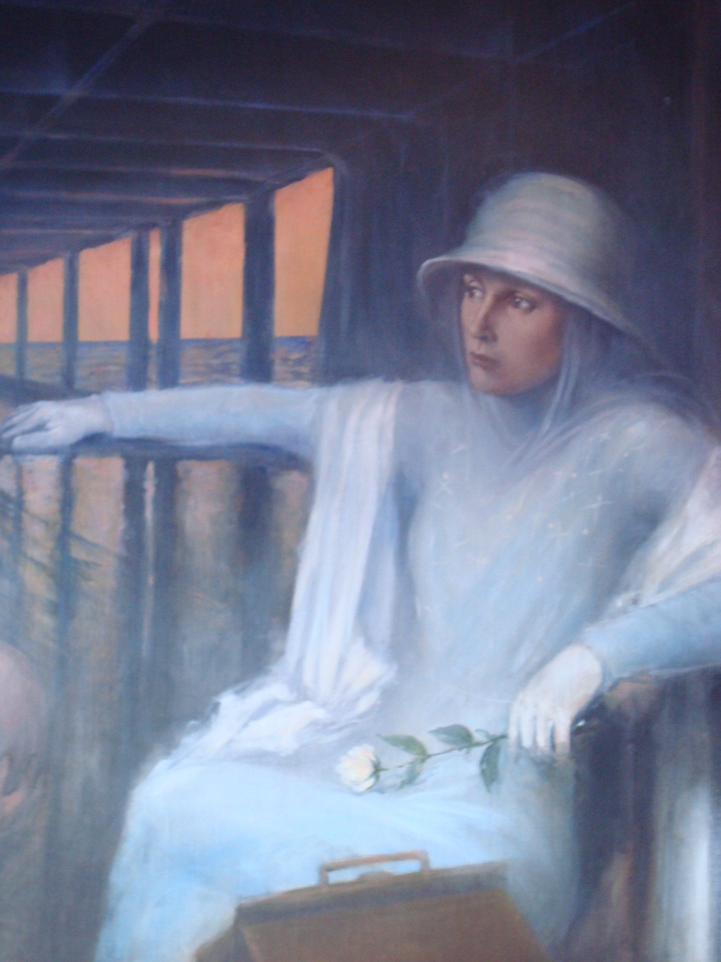
Laurie Mireau's Titanic Deck Chair painting

When precisely does a book’s backstory begin? Does is start when the author says to herself, I should write a book about this? Does it begin when someone else says to a would-be author, You should write a book about that?  (This often happens with non-fiction, by the way.) Or is it earlier?

Is it when you come across an interesting idea? A small article in a newspaper – the one you almost didn’t read?  Is it at the moment when that little piece of paper you clipped starts to invade your thoughts – unbidden?  Is it when the would-be author finally says – not I should write a book – but I want to write this book and I’m going to write it?

This issue of the germination of an idea was in the forefront of my mind earlier this week when I pulled my car up in front of the studio/home of a local watercolor artist here in Halifax.  A month ago I’d never heard of Laurie Mireau.  But since the day that my husband, who had met her about a month ago, came home with a brochure about her artwork, I had been haunted by one of the pieces featured.  The piece was a stark watercolor painting of a deck chair from the doomed ocean liner – Titanic.  Titanic has a strong connection to Halifax.  Although the ocean liner went down  closer to Newfoundland than to Nova Scotia, a number of the bodies of those who perished here brought to Halifax and are buried in a cemetery in the city.  Add onto that the fact that there is a truly fascinating exhibit at the Maritime Museum of the Atlantic and you have a storied port city that is part of the tragedy.

But there has always been something iconic about that single deck chair – the real  one that is on exhibit at the museum, as well as the replica that is for you to sit in and let your imagination run.  You lean back, your head just below the star symbolizing the White Star Line.  You close your eyes – and suddenly you’re there, on her deck.  You can smell the ocean.  You can hear the clicking of heels on the deck – no deck shoes in those days.  At least that’s how it is for me.  In any case, when I saw that thumbnail of Laurie’s painting, I had to have it.

First, I had to find out if she still had the original.  I didn’t want a print – only the original would do.  So, I contacted her and she managed to find it.  When she asked me about why I was interested, I spewed out an entire story about the deck chair, a painting that I’d seen and photographed on the wall of a bar on a cruise ship a couple of years ago and how I had an idea for a book set in about the 1920’s or ‘30’s – on a transatlantic voyage.  (No doubt she thought it was too much information!)  To tell you the truth, I didn’t have much of an idea, but it occurred to me that  the idea was germinating.  I had the distinct feeling that this might just be the beginning of a backstory for a new book that I’d write in the coming years.

gloria
My ocean-going character

It doesn’t take much to get my mind rolling.  The new book whose cover you looked at in last week’s post all started when I stumbled upon an academic article in an early music journal calling into question the  widely-held belief that St. Hildegard of Bingen, a 12th century Catholic mystic, writer, healer, composer actually knew enough about music to compose the 77 songs attributed to her.  I started thinking: if she didn’t, then who might have?

See, that’s all it takes for a backstory to start. I suppose the fact that next Wednesday I’ll be stepping onto the deck of the Queen Mary 2 in Southampton in the UK to take that transatlantic voyage to New York might have contributed to the story. I’ll let you know. (Two weeks holiday now!  See you in 14 sleeps as my hair stylist says.)

Posted in Book covers, Book publishers, Book titles

What’s in a book cover? (Part 2): The Whole Damn Thing!

Some years ago I came to the full understanding of the realities of book covers.  The book was called Patient Power! The Smart Patient’s Guide to Health Care.  I had written it with my favorite (and only) co-author, my husband Art.  I lent the health science communication and writing chops to the collaboration; he lent the medical perspective and the credibility I might add.  We were pleased with the manuscript and the editing process; we had agreed on a book title.  Then we were faced with the cover issue.

With previous experience of this publisher, I was armed with all the arguments I could generate about the importance of a compelling cover that would draw potential readers into it – that would compel them to pick it up off the shelf in a bookstore (that was before most of us browsed the title online – but I’m fairly convinced that covers matter in cyber-shopping as well – although I’ll have to do some research on this to support my contention).  That previous experience was a result of them publishing my book with a cover that resembled the flag of some unknown nation, and that reflected not even in the remotest way what the book was about.  They were planning something similar.  I could feel it. I shouldn’t have been surprised though; the publisher was the University of Toronto Press and their experience with books for the general public (which this was) was minimal.  They were used to dealing with academic tomes.

Art & I flew to Toronto to meet with the art director because we had somehow convinced the editor-in-chief that a more personalized book, perhaps with the two of us on it, might be more appealing to people interested in their health and decisions about it.  We were in for a pleasant surprise.

We took a taxi to a studio in an old brownstone in the heart of the city.  From the outside, it didn’t look like much, but on the inside the place was an amazing photo studio.  But what was more amazing was the art director himself.

New to the position, he’d been with the press for only a few months.  As we chatted, it was clear that we were on the same page, as they say.  I knew this when he shared his opinion about a cover he had recently created for another of UTPs’ books.

“I could have photo-copied the book and sent copies to all twelve of the people who were likely to read it,” he said with some irony.

His disdain for obscure academic publications was clear, and I feared for the longevity of his career with this esteemed press, but was heartened nonetheless. Perhaps we’d get more than a few colored lines across a cover with a mundane typeface this time around.  We did.

The cover was dynamite and the blow-up of it looks fantastic on the high wall of my office at home.  But I learned lessons about the importance of the visual impact of covers.  This brings me back from the late 1990’s into the 21stcentury where I’m faced with the cover situation again.

The cover we loved

Two years ago when my memoir was in the process of being published, my publisher sent me a mock-up of the cover she was suggesting, as publishers do.  I guess I’m a bit picky now when it comes to my covers, but in my view the cover suggested didn’t even reflect what the book was about (What is wrong with publishers?  Perhaps we’ll explore that question in a future post.).  A story of my journey as the mother of an elite ballet dancer who happened to be a boy, the book begged for a cover reflecting something of a life of a boy in dance.  What she sent me was a photo of a ballerina’s foot – on pointe!  Did the cover designer not even know that boys don’t wear pointe shoes?? Or did the cover designer even have the slightest idea what the book was about?

Oh well, I asked my son who also happens to be a talented photographer, if he might consider a photo.  He did and it was a terrific cover.

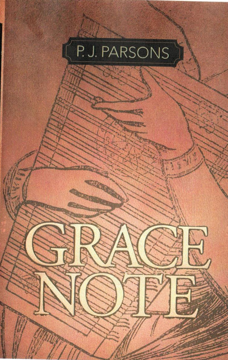
Now I have in front of me a mock-up of a cover provided by my current publisher – and I hate it.  So, to any of you out there reading this, I’m presenting to you two covers.  Please vote on the one you like best (I know that you really don’t know what the book is about – so pretend that you’re seeing it on a bookshelf.  Which one would you pick up first?

Cover choice B
Cover choice A